

What colors move you?
Could it be the cool shades of blue skies? How about the vivid hues of falling leaves? The colors of autumn are claimed to have mental health benefits. This positive effect may even lead some to take up a new hobby, embark on a home decor shopping spree, or go full speed ahead with an interior design makeover.
If you want to maximize the season’s dynamic atmosphere by creating fall-inspired spaces, read on. Likhâ rounded up some of this season’s favorite colors that you can use for home design and decoration.
The Psychology of Color
It is said that color influences behaviors, feelings, and moods. It can affect how people perceive things and communicate with others. While color psychology may still need further research, some studies on the subject point to fascinating discoveries.
For one, some cultures believe in the power of color for healing. Chromotherapy, referred to as light therapy or colorology, dates back to ancient civilizations. Researchers can trace it back to India’s practice of ayurvedic medicine. Chinese, Egyptian, and Greek cultures are also found to have used it for centuries.

Color therapy is a form of treatment to address certain mental or physical health conditions. It uses colors or the visible spectrum of electromagnetic radiation to cure diseases. For example, blue light is used to treat neonatal jaundice, rheumatoid arthritis, and tissue repair. Bright full-spectrum white light is now is also now used in treatments for anorexia, bulimia, and certain types of cancer.
Modern research also shows that colors can impact people in several ways. For example, it is observed to influence consumer purchases. Academic and work performance and stress management may also benefit from color psychology.
Colors and Spaces

People turned to creating comfortable spaces during the pandemic. The time spent at home made people realize its importance. The home provided a place of refuge from both physical and mental vulnerability. Inside, people felt they had more control over their surroundings. They had the power to choose which colors, fabrics, and décor to surround themselves with that will make quarantines and lockdowns bearable.
As society moves on to a new normal, some people may also feel the need to tweak or renovate the spaces they’re in. This is where knowledge of color psychology comes in handy. You can use colors to dictate what a specific area will look or feel like.
For this year, color experts have dropped their favorite shades. These hues will make you swoon with love for your space. Here are the top three hues you can use in home decor and interior design:
1. Blues

While blue is often connected with the blue skies of spring or the cooler blues of winter, this primary color is still a top choice this fall. Even this year’s Pantone Color of the Year -- Very Peri, is a shade of blue that can be seen from home accents to wallpapers.
According to color psychologists, blue is often associated with feelings of calm, peace, safety, and stability. It is also used to display a confident and carefree vibe.
Key tips to remember when using blue for interior design and decoration. Soft blues are suitable for areas where you need to channel your creative juices. It also aids in focusing on details while performing tasks. Darker tones are best for areas where you need to concentrate, solve problems, or make decisions.
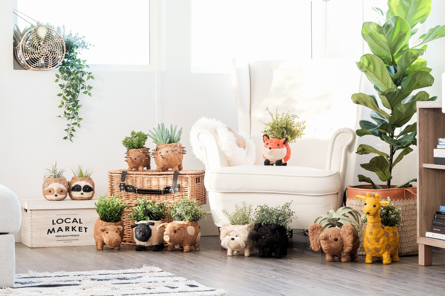
There are various ways to incorporate blue in home design. You can paint a statement wall in cobalt or the classic navy. Another idea is to use blue textiles like bedding or curtains. You can also decorate with blue accents like this Likhâ Wicker Whale Planter, Navy Blue Clutch or Teal Clutch Bag.
2. Browns

Of course, you cannot make a fall color list without the color brown. Reminiscent of the falling leaves and the earth it falls to, brown hues provide a feeling of being grounded. It evokes a sense of safety, security, maturity, and resilience. Color psychologists also say that brown reminds people of their connection to the earth, family, and home.
In interior home design, use caramel, tan, or other shades of brown to create a cozy and warm vibe. Paired with textures such as wood or natural fibers, brown tones can make a space feel welcoming. For example, you can accentuate your dining area with wooden dinnerware. Wicker tabletop bins add that warm feel and help organize space.
Brown is a rich and classic color so it works well with a variety of palettes. If you want a muted, neutral look, pair it with beige, grey, or silver. A lovely set of mother-of-pearl coasters can provide an elegant and sophisticated look to any dining area. If you want to get deeper into the autumn theme, pair brown hues with bright shades of orange, red, or yellow. Make a bold statement by hanging an orange hummingbird planter amidst a dark chocolate wall. Another idea is to make a sunny yellow giraffe planter at home on a taupe credenza.
3. Greens

Another fall favorite is green. Perhaps it is because of people’s desire to rise from the dreary pandemic feelings. Green is a color for life and renewal. It also exudes a sense of balance, harmony, and peace.
When using green in interiors this fall, go for olive or mossy greens to achieve a grounded feel. Pair with dark wood or white and marry with textures such as brass, marble, natural fibers, or wool. Station olive handwoven floor baskets in different corners of the house as planters, organizers, or accents. You can also place a row of our embroidered seagrass baskets atop an emerald green sideboard for an elegant contrast.
A Kaleidoscope of Options
Fall colors range from earthy browns and greens, calming blues, to vibrant reds, oranges, and yellows. For this season, we have shared the top three favorites that can inspire you to create an autumnal nook.
While these may be the season’s picks for interior colors and decors, the most important factor to consider is your personal preferences. Think about how you want to feel in that area of your home. Then, choose a color that best captures the look and feel you are going for. Feel free to mix and match colors. Identify what you want and check out which hues make your space look good and make you feel good.